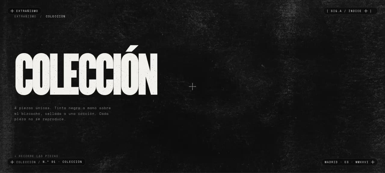
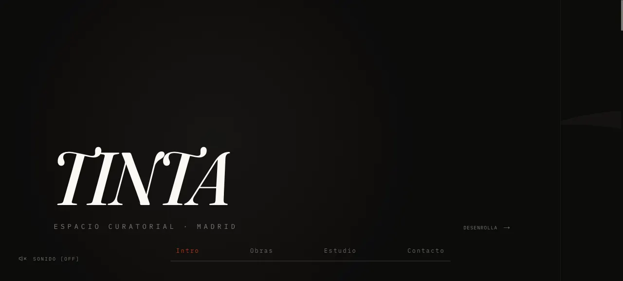
This independent musician needed a digital space that worked as an extension of his dark sonic aesthetic. The challenge was to create an environment that didn't fit any specific visual genre.
DeliriumRemen isn’t a genre, it’s an atmosphere. The brief wasn’t "a musician’s website" — it was to build a space that reads like an extension of his dark sound without resembling any other artist site. No Spotify templates, no cover grids. The site had to sound like him before a single note played.
The bet: treat atmosphere as a design material. Colour stops being a logo and becomes mood — it shifts temperature without warning; emptiness stops being background and becomes the silence between notes. The identity comes from the music itself, not a moodboard.
- Atmosphere, not genre
- Anti-Spotify
- Colour as mood
- Monospace and emptiness
- Listen
Translate a sound into a screen
I listened to the material before designing anything. The identity couldn’t come from a Pinterest moodboard: it had to come from the music itself — dark, label-less, in constant mutation.
- Art direction
Monospace and emptiness as instruments
I chose a monospace typeface and extreme negative space: the page breathes like a track with long silences. Colour isn’t fixed; it shifts temperature without warning, just like the live show.
- System
Three temperatures over the same black
Instead of a brand colour, I defined three states — neutral, warm and cold — sharing structure and typeface. The site changes temperature without breaking coherence: colour is a mood, not a logo.
- Build
Next.js and restrained motion
Built with discreet animations. The discography is shown without noise, image-forward, prioritising fast loads over spectacle.
Designed a minimalist space with monospace typography and extreme negative space. The discography is presented on a near-black canvas with a mutable color identity that shifts temperature without warning.
The identity has no fixed colour: it has three temperatures. A neutral monochrome base state that shifts to warm (amber) or cold (blue) without warning, always over black and always in a single monospace family. Colour is a mood, not a brand.
- Three temperature states — neutral, warm, cold — shifting without warning.
- A single monospace family (iA Writer Mono): coherence born from restraint.
- Neutral is the base; colour is an accent that breathes, not the identity.
- No images: monospace character and text are the only material.
The three-temperature identity only means something if you feel it walking through the site. These are the places where the black mutates and the emptiness breathes.
- 01 · Entrance
No logo, no grid: monospace and extreme negative space drop you into the atmosphere before a note plays.
- 02 · Discography
Image-forward, no noise. The work is shown as work, not as rows of a player.
- 03 · Temperature states
Colour shifts between neutral, warm and cold without warning — the site changes mood like the live show, always over the same black.
- 04 · Restrained motion
Discreet animations that accompany the silence; spectacle stays out so the atmosphere doesn't break.
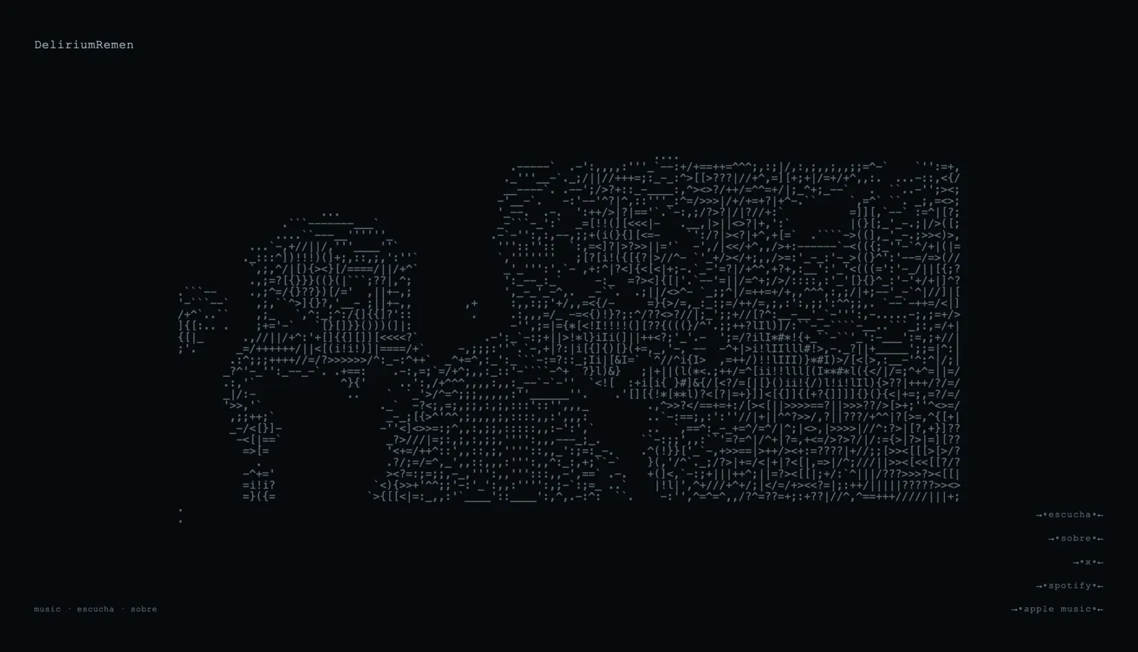
The site does what it set out to: look like no other artist website. It works as an extension of the sonic project — you enter and you’re already inside its atmosphere, before pressing play. Fast loads, discreet motion, and an identity recognisable without a logo.
A music website doesn’t have to sound like Spotify. It has to sound like the artist.