This Madrid-based psychotherapist needed to capture online patients with a website that projected professionalism. The site had to remove the coldness of traditional clinics to lower the barrier for the first appointment.
Pablo doesn't treat just any pain: he accompanies grief, a person's most vulnerable moment. And there the website had a clear enemy — the clinic cliché: corporate blue, stock photos, cold forms. All of it raises a barrier exactly when the opposite is needed. The real brief wasn't "a therapist website", it was making writing that first message stop feeling daunting.
The bet: invert the category's code. Where medical authority is expected, give editorial warmth; where clinical distance is expected, the tone of a conversation. Every later decision — type, colour, space — was measured against one question: does this accompany or intimidate?
- Grief and vulnerability
- Anti medical-brochure
- Editorial warmth
- Therapy in Madrid
- Listen
Understand grief, not the industry
Before opening the editor, I mapped the visitor's real fear: clinical coldness. The core decision was made here — the site shouldn't feel like a clinic, but like the first step of a conversation.
- Art direction
Editorial warmth, not a medical brochure
I dropped the healthcare blue and the stock library. Instead: a paper background, a literary serif that humanizes, and a sage green borrowed from nature. The screen had to lower the guard, not project authority.
- System
Tokens, not loose screens
I built a design system — colour, type, space — rather than laying out page by page. Newsreader for the human, Inter for the functional. Every section breathes alike and coherence is structural, not decorative.
- Build & launch
React + Vite, form and speed
Built with React + Vite, with a Resend-powered form so first contact was direct and frictionless, subtle GSAP details, and SEO aimed at grief therapy in Madrid.
Built the interface with React + Vite and integrated a contact form with Resend to streamline first contact. Added subtle GSAP detail animations and took care with mobile performance, where most traffic lands.
The system springs from a single decision: the website shouldn't look like a clinic. An earthy palette, a serif with literary weight, and one calming green accent. Every token exists to shorten the distance between the visitor and that first message.
- Paper background, never clinical white: the screen rests the eyes.
- Serif for the human, sans for the functional: hierarchy by temperament, not just size.
- A single sage accent: calm and nature, nothing corporate.
- Even the muted text is warm — clay, not grey.
The system doesn't live in a manual: it lives at every point where the visitor decides to stay or leave. These are the places where the warmth had to show.
- 01 · Home and hero
The first screen opens with a literary serif on a paper background — no blue, no stock; in three seconds it says conversation, not clinic.
- 02 · Contact form
The most delicate point: writing that first message. Direct, frictionless fields wired to Resend; the sage accent guides without pushing.
- 03 · Service sections
Every service breathes with the same space and the same hierarchy by temperament — serif for the human, sans for the functional.
- 04 · Mobile
Where most traffic lands: the same warmth and hierarchy, without trimming the system to fit the small screen.
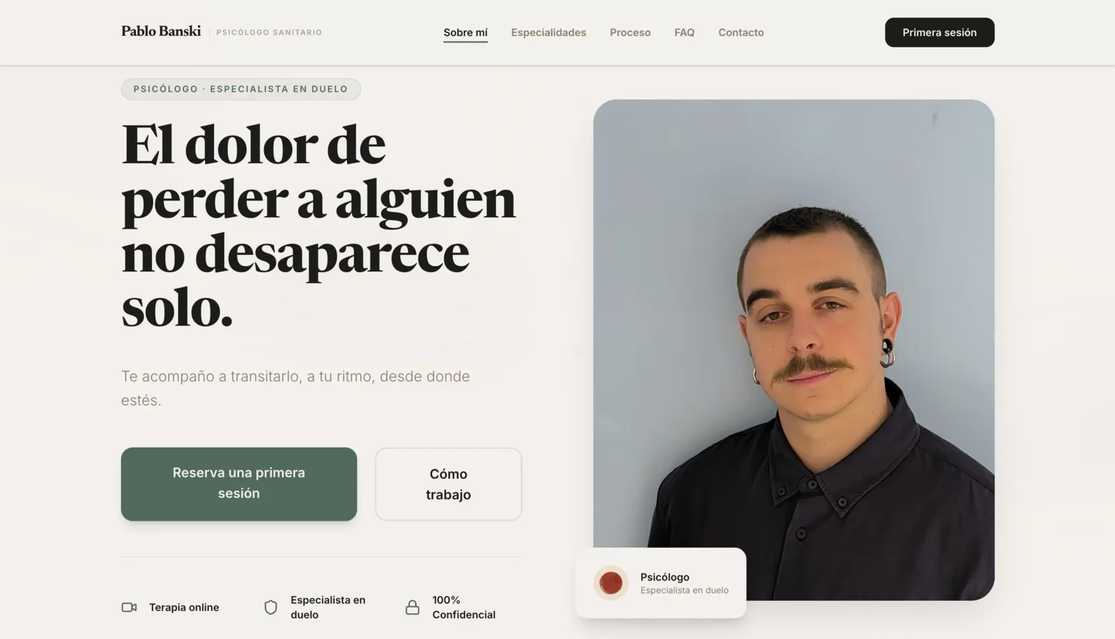
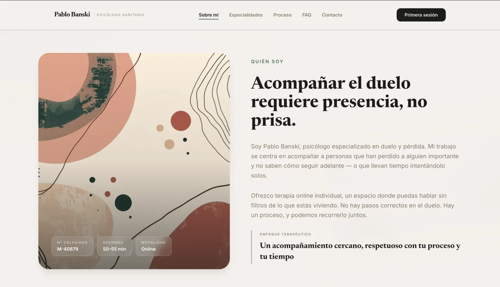
The site does its one job: it makes writing the first message stop feeling daunting. A direct, frictionless form, and a presence that reads like a conversation rather than a clinic brochure. The visitor arrives looking for help and finds an open door, not a reception desk.
A psychology website doesn't have to look like a clinic. Sometimes it's enough for it to look like a conversation.